hi, Anthony here! Every week, I find articles and posts around the web about product development and how to build great products. Then I summarize and share them here.
Let’s get to it!
A Clever UI Design Shortcut
To quickly communicate UI ideas, use this method developed by Ryan Singer from Basecamp.
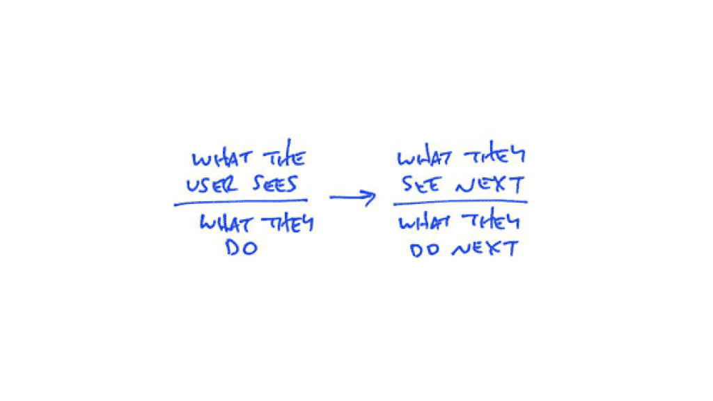
This shorthand design system is constructed as follows:
Flows are made out of individual interactions. Every screen gives the user options, then the user chooses one. Then something happens, and the screen changes.
Above that line bar is what the user sees. Below the bar is what they do, particularly the primary action the user can take.
An arrow connects the user’s action to a new screen with another action.
Example
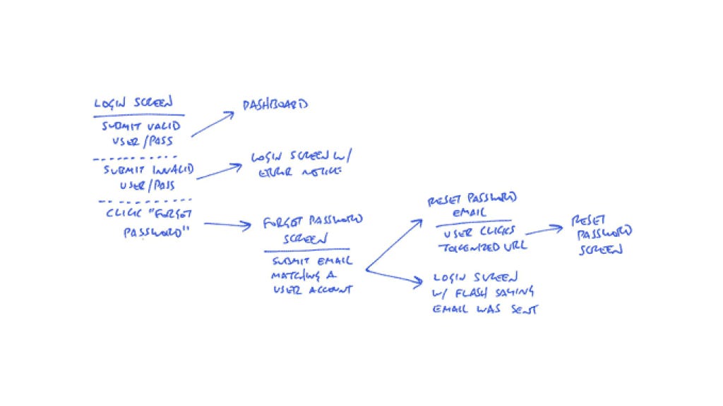
Here’s an of a log-in flow, using this shorthand:
A few new notations:
The dotted line separates alternate actions. For ex: There’s only one login screen, but there are multiple possible actions on that screen. Think of it as “or”.
When there are multiple actions, the arrows point from an action to a new screen. Uninteresting screens or ones that are out of scope have no bar below them. For ex: “Dashboard” in the above diagram.
Where you see two arrows pointing from an action, that’s two different screen resulting from that action. For ex: “Forget password screen” leads to both “Reset password email” and “Login screen”. (Emails are part of the UI flow)
End
The real benefit of this format is that it’s really fast to sketch, and it communicates the essentials of what needs to happen as you’re imagining it.
Do you think you’ll start using this in your workflow? 🤔
🔗 You can find the full article here.
End Note
Thanks for enjoying The Product Person. I’d love it if you shared it with a friend or two. If this was shared to you, you can subscribe here.
❤️ Hit the heart button as well, it helps a lot.
Have a great day,
Anthony


Great article! I've always thought that the standard ERD / Use-Case Diagram was a little ugly and didn't paint as nice of a picture as it could