The Power User Curve
hey, Nick here! In this newsletter, I curate insights and timeless principles on how to build great products. You’ll improve your product skills with every issue.
Here’s an article for you today...
The importance of power users
“Power users drive some of the most successful companies — people who love their product, are highly engaged, and contribute a ton of value to the network.”
Behind every successful product is an army of power users. It’s not about how many people use the product, it’s about how many people love the product.
But how do we measure the number of power users?
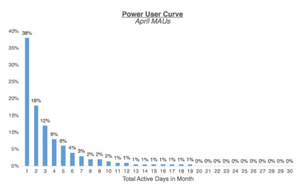
One way is by creating an activity histogram, also known as the “Power User Curve”.
The Power User Curve will “smile” when things are good
This is an ideal curve for a social product. The graph should look like a “smile” and your power users exist in the far right group.
Ideally, over time you will see the numbers on this graph shift to the right.
For example, Facebook has a very right-leaning smile, with 60%+ of its MAUs coming back daily.
The Power User Curve can show when strong monetization is needed
Not every product is like Facebook. Some products aren’t built to have daily engagement, they are providing value in other ways. In these cases, it’s important to monetize when your users are engaged.
With an investing product like Wealthfront or networks like LinkedIn — few users are likely to actively check it on a daily basis, but that’s ok, since they have business models that aren’t tied to daily usage. Are there ways to generate revenue when your users aren’t on your platform?
The trend of overtime can show if the product is getting more engaging over time
Plotting cohorts of when users joined can be extremely insightful. Over time, you can see if you are improving your ability to generate more power users.
Why does this all matter?
“Power user analysis allows you to get a better understanding of how users are engaging with your product, and make more informed decisions using that data.”
There isn’t a silver bullet for product metrics, but using the Power User Curve as a framework can help you unlock insights on what’s working and build a product roadmap for success.
Link to the full article by Andrew Chen.
End Note
Thank you for reading. If this was shared to you, you can subscribe here.
For bite-sized product tips in your twitter feed, follow @ProductPersonHQ.
Have a great day,
Nick


