🛠️ The Product Person #20: UX Design for Data-Driven Apps
⚡12 pro tips for designing data-driven interfaces
Hello hello product people,
It’s been 2 weeks since my last issue.
A lot’s happened since then. A good lot. I launched a weird Zoom-like video app in 15 days for Product Hunt’s Maker Fest and I received a writer’s grant from Substack. Plus, I turn 21 tomorrow (🥳).
But, within all this, I’ve been working hard to make issue #20 supremely useful.
A while back, a reader asked me to do an issue with some pro tips for designing data-driven apps. So I thought, “why not find as many best practices as I can and write about those?”
So I did.
Here it is:

Designing data-driven apps is tricky.
The interfaces you use daily are designed to be fairly frictionless. Clean, spacious, minimal. They help you send texts, stream videos, and mindlessly scroll through your newsfeeds.
Examples: Facebook Messenger, TikTok, Twitter, etc.
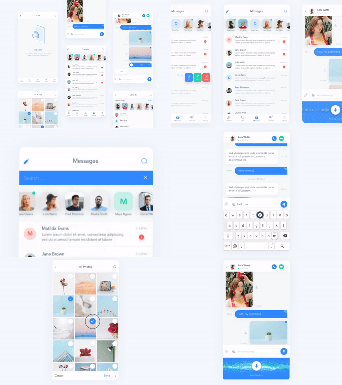
Source: Outcrowd on Dribbble
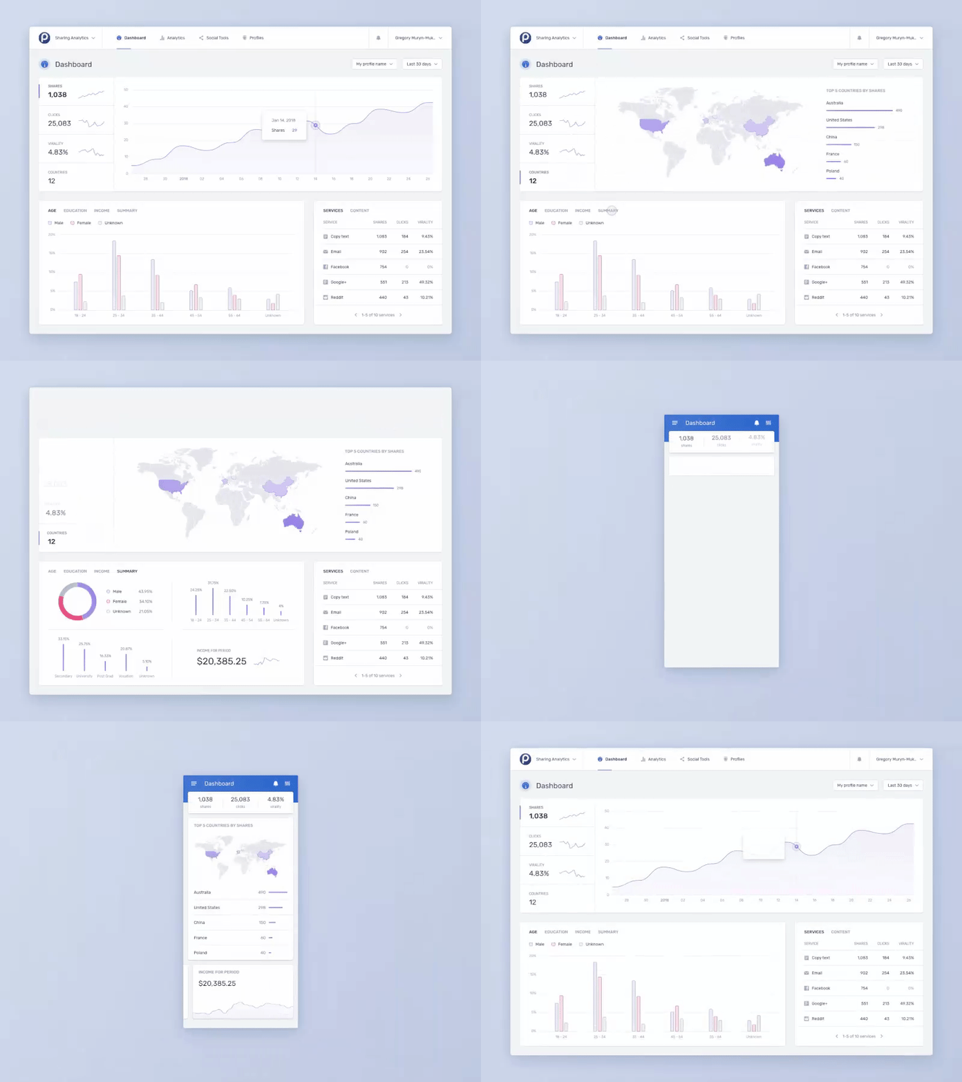
Interfaces on enterprise products are different.
They’re made for performance, favoring function over form. They enable you to analyze business expenses, track logistics, and monitor key metrics.
Examples: Microsoft Excel sheets, Google Analytics dashboards, etc.
Source: Gregory Muryn-Mukha on Dribbble
Best Practices
Here are some best practices when it comes to designing for enterprise applications.
Identify your personas
Different users need different data in different ways.
Your users (most likely executives, managers, and analysts) will need specific information from complex data in order to do their jobs.
Some user may need your app to open on multiple displays at once.
Identify those personas upfront so you can cater the data precisely to their needs.

Source: harold on Dribbble
📌 For tips on identifying the perfect personas, this article by Cooper is stellar.
Reduce data volume
Your app probably doesn’t need a mission control aesthetic.
Make cuts based on what your users use most.
And get rid of redundant data. Often, the same data is shown but in multiple variations.
Combine elements where it makes sense. For example, turning first and last name fields into a single “name” field.
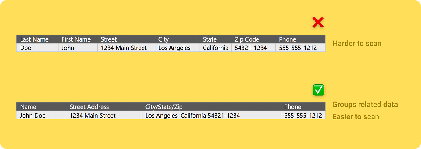
Another way to reduce the data shown to the user is to shape the page.
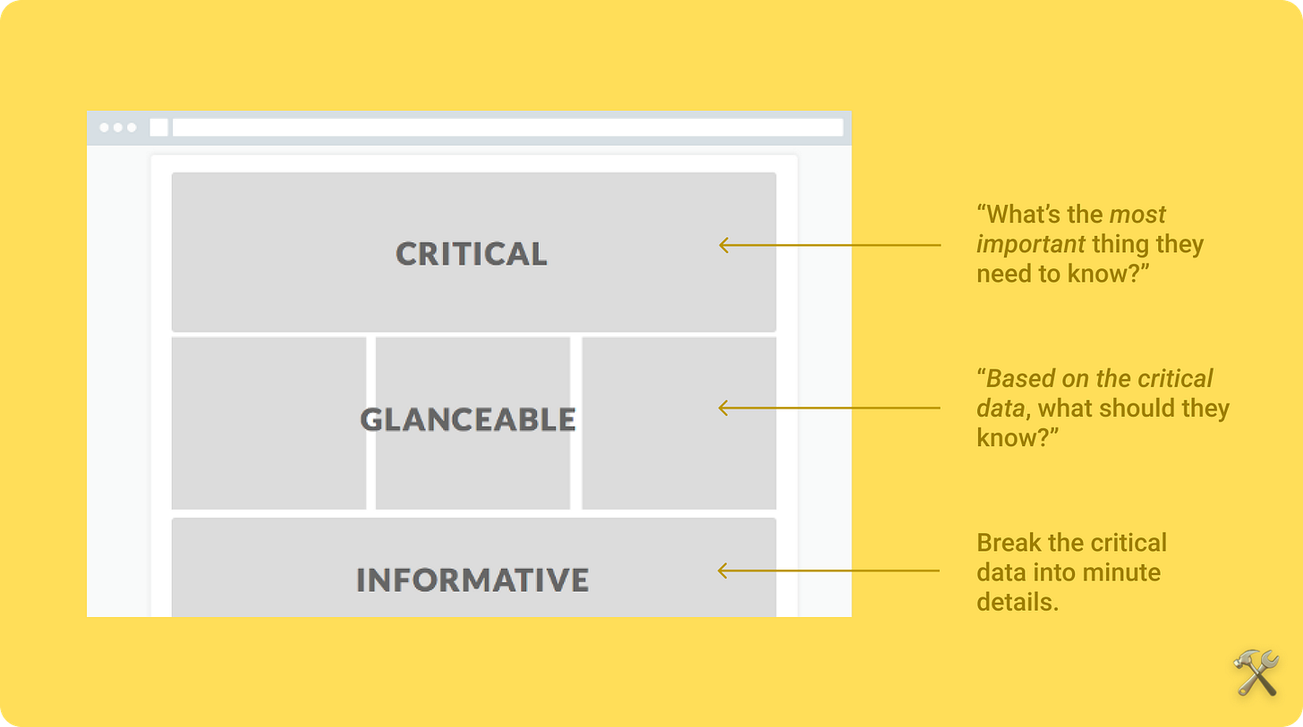
Give your interface structure.
Present the user with essential information first. Then follow it with supporting content.
Ask yourself: "What story are you telling with the data?"
Choose the *right* visualization
A common trap is to favor aesthetics over function.
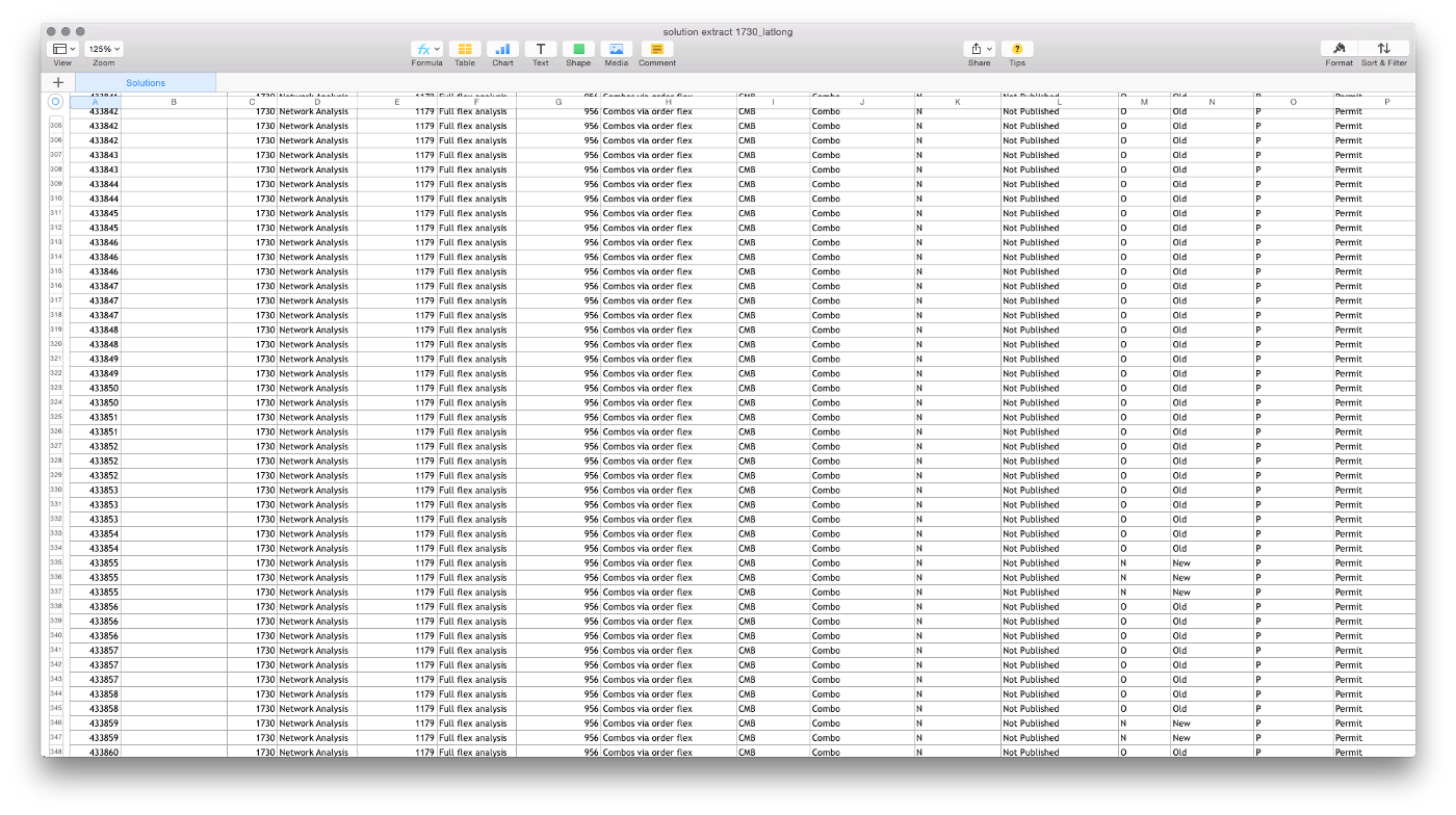
To avoid that, start ugly —with raw data.
Starting this way will help you think through the relationships in the data and stick to solving your user's problems.
Some extra pro tips:
To show how a value changes over time, use a line chart.
To show distributed values, use a histogram.
To show a summary of values, use a table.
📌 Basecamp wrote a very opinionated blog post on why you only need these three kinds of charts.
🔨 A great tool for visualizing data is Tableau —but it’s uber expensive.
📚 A great book on visualizing data is “The Wall Street Journal: Guide to information Graphics” by Dona Wong —which is not uber expensive.
Use good typography standards
That don’t simply mean font types. Font weight, kerning, and spacing impact a user’s ability to quickly read and interpret data from an interface.
Consider using monospaced numbers.
Consider decimal-alignment of currency to represent dollars and cents.
Keep line heights narrow but have enough whitespace for legibility.
This gif below shows a great example:

Source: Gregory Muryn-Mukha on Dribbble
Use color with purpose
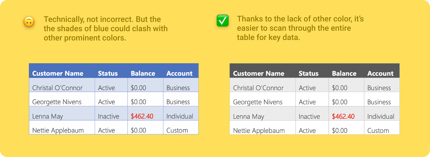
Use a conservative color palette. Save eye-catching colors for important data —like error messages (usually red), key metrics, or link text.
📌 If you still want more info on choosing the right color palettes to visualize data, I recommend this article by Invision.
Avoid over-designing tables
Some advice from the typography bible, The Elements of Typographic Style by Robert Bringhurst:
Edit tables like text —they need to be read.
Avoid the urge to cram information into a space.
Keep “furniture” to a minimum (ie rules, boxes, dots, and other visual guide-rails)
Know when to increase density
When increasing density in your interface, think about which elements are essential and which are more for aesthetic.
✅ When to apply density
When users work with lots of data, adding density can improve the experience.
Increased density means more content on-screen. When working with lists, tables, and long forms added density makes information easier to scan, view and compare.
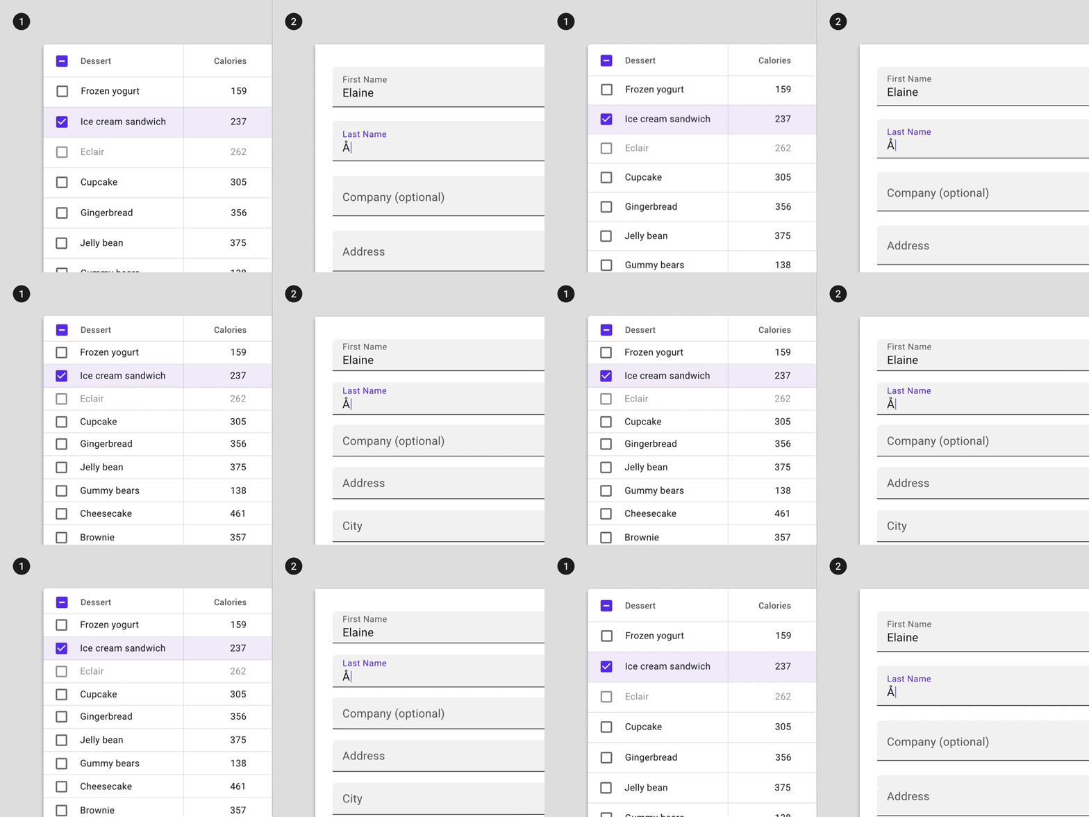
Source: Google’s Material Design docs
❌ When not to apply density
Don’t increase density on components that alert users of changes, such as snackbars or dialogs. Increasing the density of alerts makes them less readable and less effective at attracting user attention.
Similarly, don’t increase density of components that involve focused tasks, such as dropdown menus and date pickers. The increased density reduces usability by limiting tappable space.
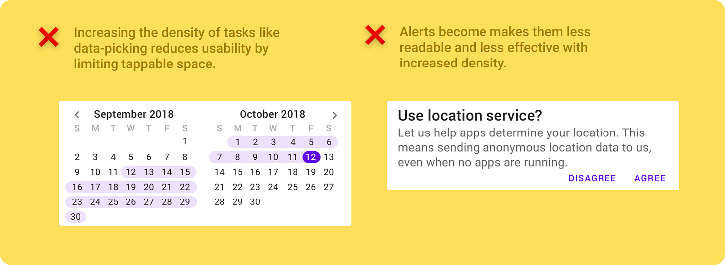
Let users export data, instead
When dealing with large data sets, it may be best to allow users to export that data to another tool where they can interact with it better.
Give your users the ability to export the data they’re looking at via XML, XLS, JSON, or CSV.
One cool thing you can also do is display as much data as you can and if the user wants to see more data then they can export the data you display plus more data that you couldn’t fit into the screen.
Don’t forget about touch
Unless you’ve completely ruled out touch-based interactions from your interface, don’t forget the minimum sizes for touch targets.

📌 Google’s Material Design docs has good guidelines on touch targets that you can find here.
📌 They’ve also laid out new design standards for increased density in enterprise apps. They have great tips and practical examples on how density affects your interface. You can read more about that here.
Know when to use text instead
One way to turn seemingly useless data into useful data is to use text to communicate exactly what the user wants to know.
COVID-19 trackers are a good example. With these in particular, you want to prioritize actionable data over volume of data.
Using text allows you to do that.
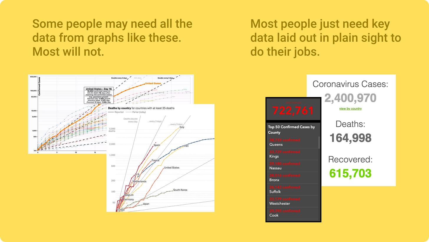
The “So What?” test
People use data to get shit done. Help them do that.
After you’ve finished creating your interface, scrutinize each component.
Ask yourself, “Is this important for the user to get their job done?”
If not, then find a way to make it useful —or remove it.

Wrapping it up
⚡The 12 pro tips for designing data-intensive apps
Identify your personas upfront
Reduce data volume
Shape the page
Choose the *right* visualization (“Starting ugly” helps with this)
Use good typography standards
Use color with purpose
Avoid over-designing tables
Know when to increase density
Let users export data, instead
Don’t forget about touch
Know what to use text instead
The “So What” Test
📌 I used many resources to put this issue together but the two most useful ones were:
“Designing Data-Driven Interfaces” by Ex-Uber Design Director, Erik Klimczak
“How white space killed an enterprise app (and why data density matters)” by Christie Lenneville & Patrick Deuley

🐦 I hope you enjoyed this issue. If you could show some love to this tweet thread, I’d really appreciate it.
👋 Also, come say hello in the Telegram group chat. I call it “Product Peeps.”
Thanks for reading today’s issue 😊
Enjoy the rest of your day.
-Anthony
PS. I just realized I’m releasing issue #20 on the last day I’ll ever 20 years old (🤯).
Also, not expecting b-day wishes but, uh, you can if you want (😉).


