🛠️ The Product Person #16: Aim For The Heart
Here are some tactical product design tips to inspire happiness in your users.

❤️ Aim for the heart
Here are some tactical product design tips to inspire happiness in your users. Most are common sense. But hopefully the examples put them into good context.
Purposeful imperfection
This adds a human touch. It makes your brand look more personal and approachable.
Ex: Typeform’s logo

Humor
Laughter triggers positive emotions. Make your users laugh and you’ll be associated with those positive emotions.
A few ways to do it:
Exaggeration: Take a familiar, benign situation and make it extreme.
Ex: Basecamp uses it here to depict project management getting messy.

Character: Add a cute and amusing animal or person.
Examples from Mailchimp, Trello, & Github.

Analogy: Show how your product can be useful for an unexpected use.
Ex: Monday.com plots out the tasks-to-be-done for Game of Thrones’ warring characters.

Gamification
Exert game mechanics into a non-game environment —like a website or a mobile application.
Gamification can trigger feelings of joy and accomplishment and allows users to spend more time in your product.
Ex: Salesforce’s Trailhead program teaches people how to use Salesforce via challenges, quizzes, points, badges and cute illustrations.

Illustrations
It’s easier for people to project themselves onto a character in an illustration than a photo of another person.
Some great illustration libraries: Open Peeps, Ouch by Icons8, and Buttsss (my personal fave).
Ex: Asana’s homepage.

Delightful surprises
Counteract actions that may cause uneasiness with delightful surprises. Serendipitous encounters can leave lasting impressions.
Ex: Right after sending an email to your email list, Mailchimp reassures you with this animation and the words “Rock on! Your email has been scheduled.”

Another fun example is Google Chrome’s dinosaur jump game that starts when you lose access to internet. Sometimes, I don’t want the internet to come back on just so that I can keep playing.

Mirroring effect
Present user with emotion in your design & they’ll mirror that feeling subconsciously.
Ex: Duolingo uses its mascot “Duo” to guilt trip users back to the app if they’ve missed a language lesson.
According to the Verge, developers at Duolingo mastered the emotional effect to the point where they know the perfect number of teardrops Duo should cry.

Duolingo’s owl is resonated so well that he became a certified meme.
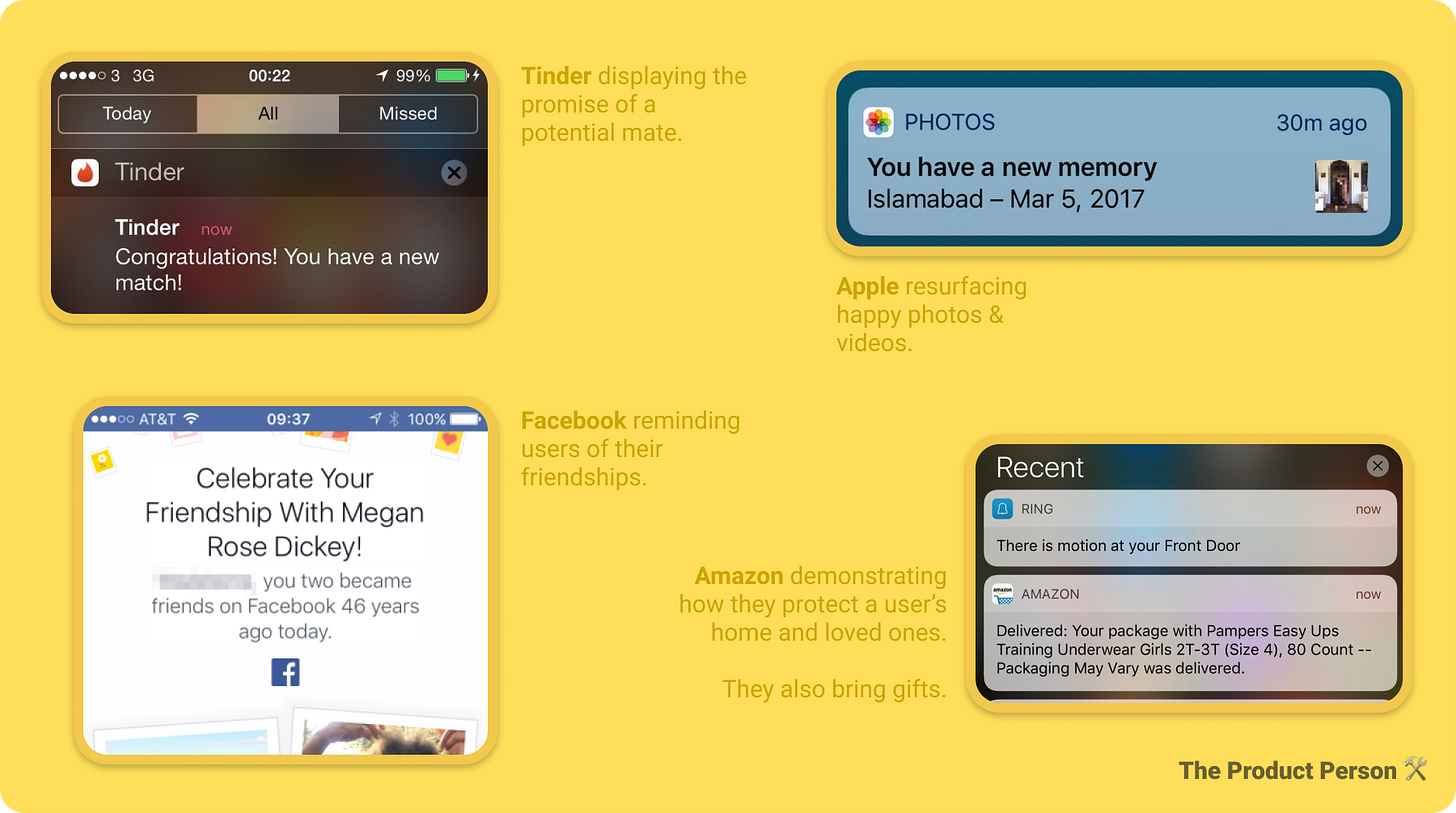
Cocktail party effect
Present your user with important information that’s relevant to them (within all the noise). Info like their name, people they know, activities they’ve done in the past, objects they own, etc.
Examples from Tinder, Facebook, Apple, and Amazon.

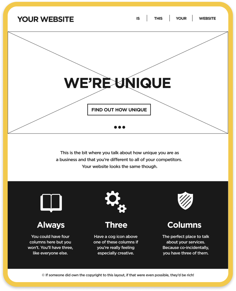
Mere-exposure effect
Imitate familiar design standards from the most popular and most used products. People tend to develop a preference for things merely because they are familiar with them.
Examples from Apple, Instagram, Airbnb, and Medium.

You might enjoy this satirical take on business website design by NoVolume:

Appeal to pride
Give your users the joy of self-expression.
Can they tell a story about it? Does your product appeal to their self-image?
A good hardware example is Apple’s Airpods.
It provides benefits to its user whether it’s on or off. When it’s on, it’s a great pair of bluetooth headphones. When it’s off, it’s an even better signal of one’s values: preference for simple luxuries, forward-thinking, and looking cool.
A good software example is Superhuman —a $30/mo email service.
Few people are Superhuman users. There’s a waiting list of over 100,000 people. Superhuman users love talking about how much they love Superhuman. Because they have it and you don’t. Pride.

Have a mission
Allow your users to become members of a movement. Allow them to contribute a cause and make a difference when they use your product.
Ex: David Heinemeier Hansson (@DHH) is launching a new email service in April called Hey.com. He’s established the narrative that “email today sucks, but we can save it and get back to the glory days.” #MEGA
Users of his upcoming product won’t just be using another email service, they’ll be radicals in a movement —an email revolution.

Some quick social proof guilt-tripping
Quentin purchased a paid subscription to The Product Person last week, to support me —the $50 yearly subscription at that.
The monthly plan is just $5.
Be like Quentin. Become a paying reader today.
❤️ Thanks for reading Issue #16. This was super fun to write. Share this with a few of your product buddies —I think they’ll really enjoy this.
🐦 Tweets about product: @ProductPersonHQ // My personal twitter: @antdke.
🤗 Not subscribed yet? You can subscribe here.
Enjoy the rest of your week :)
-Anthony


