🛠️ The Product Person #15: Happy Design pt. 1
A deep dive into how to design your product to make users happy.

benefits of happy users
A study monitored the emotions of 8,000 people after they interacted with the top 250 websites in e-commerce, healthcare, travel, entertainment, and banking.
Here’s what they found:
Lack of success on a site = low happiness.
Sites that were hard to use and navigate through received a low happiness rating. People spent less time on these sites.
Sites that followed similar and familiar design patterns were easier to use and made people happier. For ex: Amazon, Zappos, Expedia.
Users are more likely to return & recommend with others if they felt happy when using a site.
Users perceive sites as better than others when they leave with feeling happy.
Users are more likely to explore and engage when they’re happier —their attention is higher quality.
Happy users are more loyal to a brand. They’re more likely to purchase, take action, and recommend to others.
When recalling their experience, users couldn’t distinguish ease of use from marketing copy from delightful micro-interactions. The holistic product experience determined their happiness.
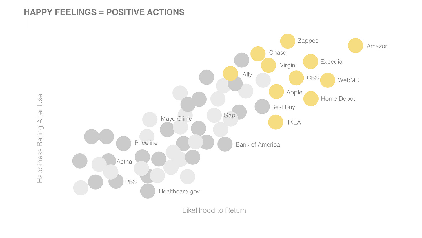
This graph compares how happy a site made a user vs. their likeliness to use it again:
🌟 Happy user = Returning User

The most impressive stat I found regarding making users happy affects your conversion rates.
A well designed user interface coupled with a great user experience can increase your conversion rate by 400%, according to Forrester.
design for happiness (part 1)
So, how exactly do you design for happiness?
There are a few aspects to this. One important one is avoiding cognitive overload. Which just means “don’t make people think so hard”.
🧠 Avoid cognitive overload
The first impressions of your product will be 94% design related.
People have a bias for remembering negative experiences. So if they feel sleaze or heaviness from the start of their journey through your product, then that’s the anchor you’ll have to fight against for the rest of it.
Hick’s law states that the more complexity and options you present your users with, the longer it’ll take them to reach a decision. It’s common sense, but often neglected in an effort to add “more” to a product. People aren’t obligated to stick with your product. Give them too much work, then they’ll spend their time elsewhere.
Whether it’s your website’s landing page or your app’s sign up page here’s what you need to do:
At the start, keep content light, concisely display your product’s usefulness, and welcome the visitor to explore more.
Use whitespace to avoid visual clutter—allow your product to breathe. Let the user consume at their own pace.
No irrelevant info —it competes with important information and diminishes its visibility.
Have less important information? Put it in the middle. Most important stuff at the start and end. And if the user is viewing horizontally, then leftmost and rightmost.
Follow design patterns that users are used to. Straying away from conventions, no matter how #creative, worsens your UX. For ex: Moving the logo from top-left to top-center makes it 6x more difficult for users to get back to the homepage of your website.
Give hints. Present a sneak peek of what will happen before your user takes a certain action. For ex: Saying “You won’t be charged yet” or “Credit card needed” next to a purchase button.
Avoid poor information architecture. This means site maps, navigation, menu items, etc. Make sure info is placed in spots where it makes the most sense. Otherwise, your users won’t easily find what they’re looking for.
Offload tasks from users. Look for where you can use alternatives to making your user have to use mental effort. For ex: show a picture, re-display previously entered information, set a smart default, etc.
Recognition over recall. Minimize the user’s need to memorize to basically 0. Necessary info, like instructions, should visible and easily retrievable when appropriate.
Progressive Disclosure. Break down any complexity into lightweight, consumable chunks. Webflow does this very well with their 2 min-witty tutorial videos. At first glance, Webflow can feel like being at the helm of a NASA space shuttle but their “learning at the right time” approach helps alleviate that pain.

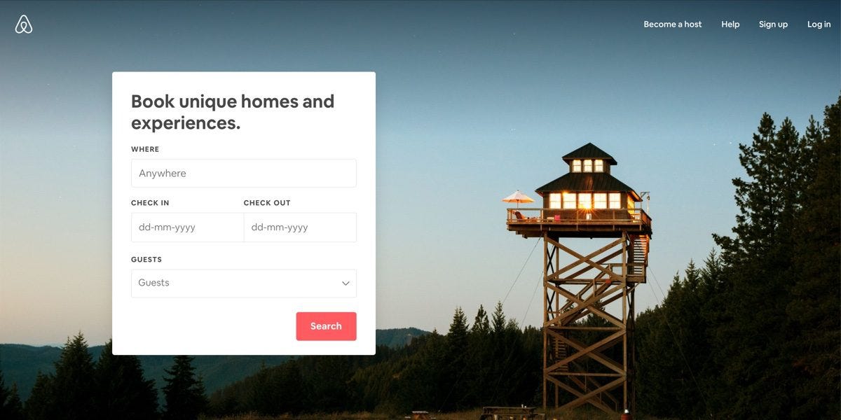
AirBnb’s website is a supreme example of avoiding cognitive overload.
to be continued
You might’ve guessed from the title. Today’s issue is part 1 of a short series. The next few issues will cover this topic of designing your product’s UX to make your users happy —backed by data & behavioral psychology.
Thanks for reading & have a beautiful week 🌻
- Anthony


